DURATION
TEAM
TOOLS
TEAM
TOOLS
Feb - May 2021
CORE TEAM: 1 Project manager, 1 UX/UI designer │ COLLABORATED WITH: Client & Develop Team
Figma, Adobe illustrator
CORE TEAM: 1 Project manager, 1 UX/UI designer │ COLLABORATED WITH: Client & Develop Team
Figma, Adobe illustrator
ROLE
• Interviewed stakeholders and analyzed the market.
• Redesigned a mobile application UI by adding new features.
• Led the interface and visual design and communicated efficiently with developers to implement them.
• Redesigned a mobile application UI by adding new features.
• Led the interface and visual design and communicated efficiently with developers to implement them.
OVERVIEW
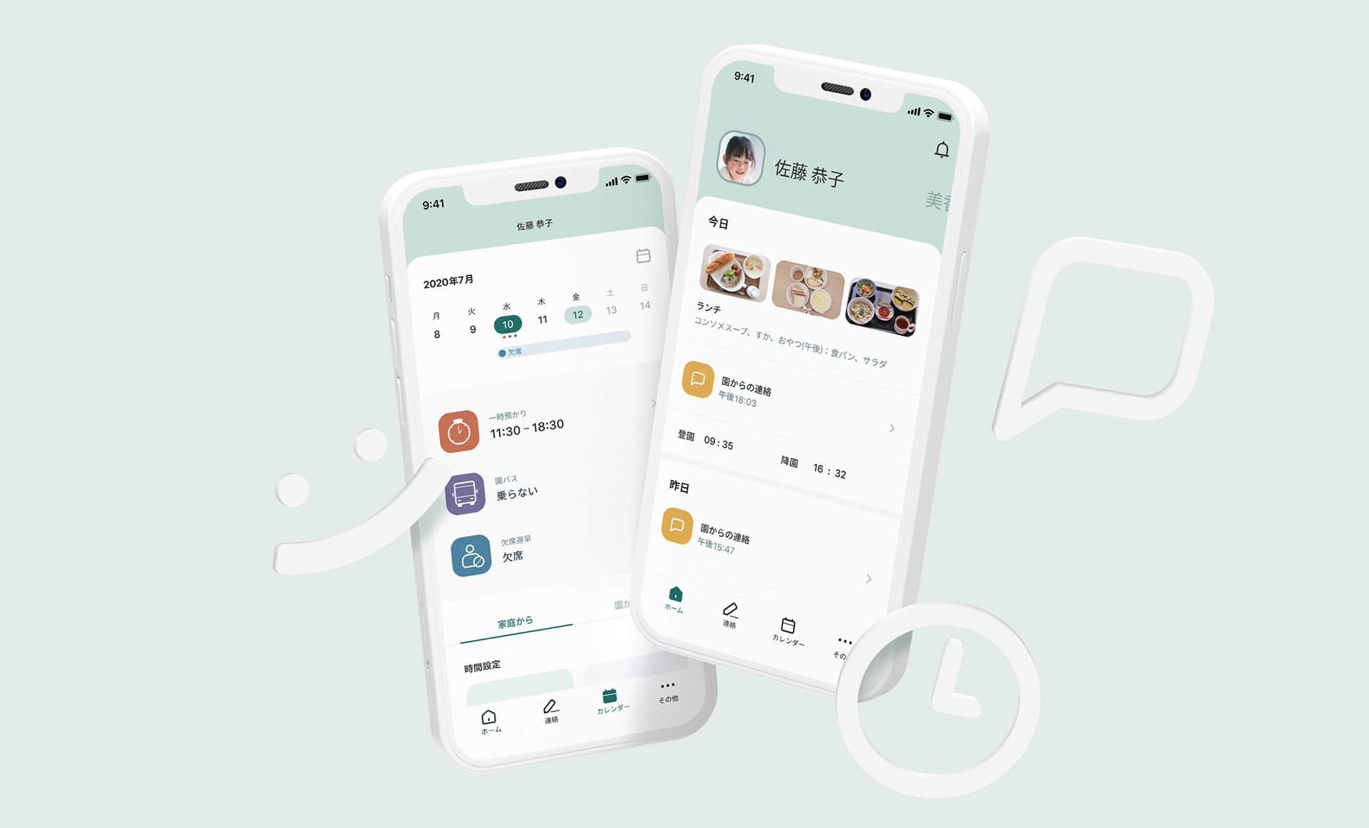
The product's ultimate goal is to ensure that all communications related to nursery schools can be carried out in our app. We designed an app to make it intuitive and simple for parent users to handle their daily tasks from contact feedback and attendance management to bus reservations for the nursery school.
PROBLEMS
• Complex: It's hard to find each menu due to the unclear criteria for classifying the menus.
• Inconsistent: The old app didn't have a clearly defined concept and visual system.
• Inconsistent: The old app didn't have a clearly defined concept and visual system.
MAIN TASKS
• Bring clarity to the UI and make the app UX easy for parents with low digital literacy to use.
• Provide looks and experiences that differentiate the app from competing products.
• Provide looks and experiences that differentiate the app from competing products.
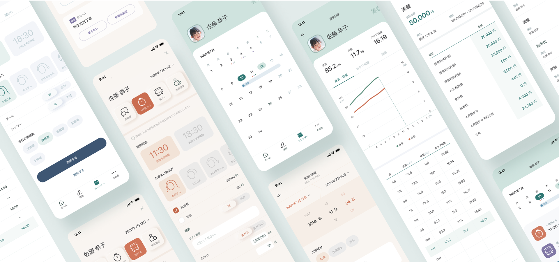
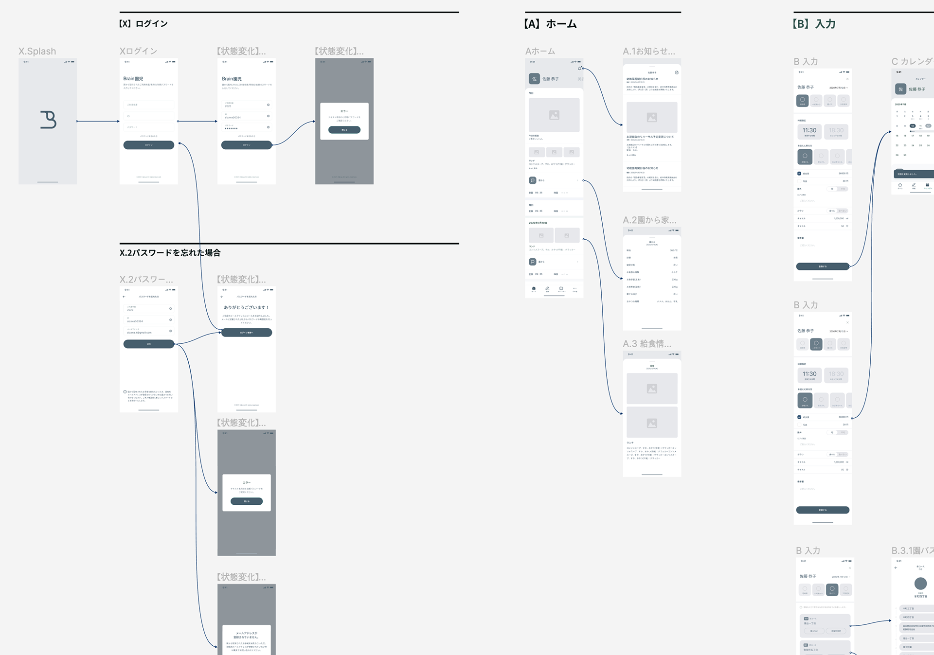
INFORMATION ARCHITECTURE
We started by classifying the parents' daily repetitive tasks, categorizing them into four.
After, we rearranged various tasks according to their context and designed the screen flow to facilitate their tasks.
After, we rearranged various tasks according to their context and designed the screen flow to facilitate their tasks.
SOLUTION
Performing daily routine tasks lightly
The product's primary purpose is to alleviate parents' childcare burden related to nursery school.
The product's primary purpose is to alleviate parents' childcare burden related to nursery school.
Lighter tasks
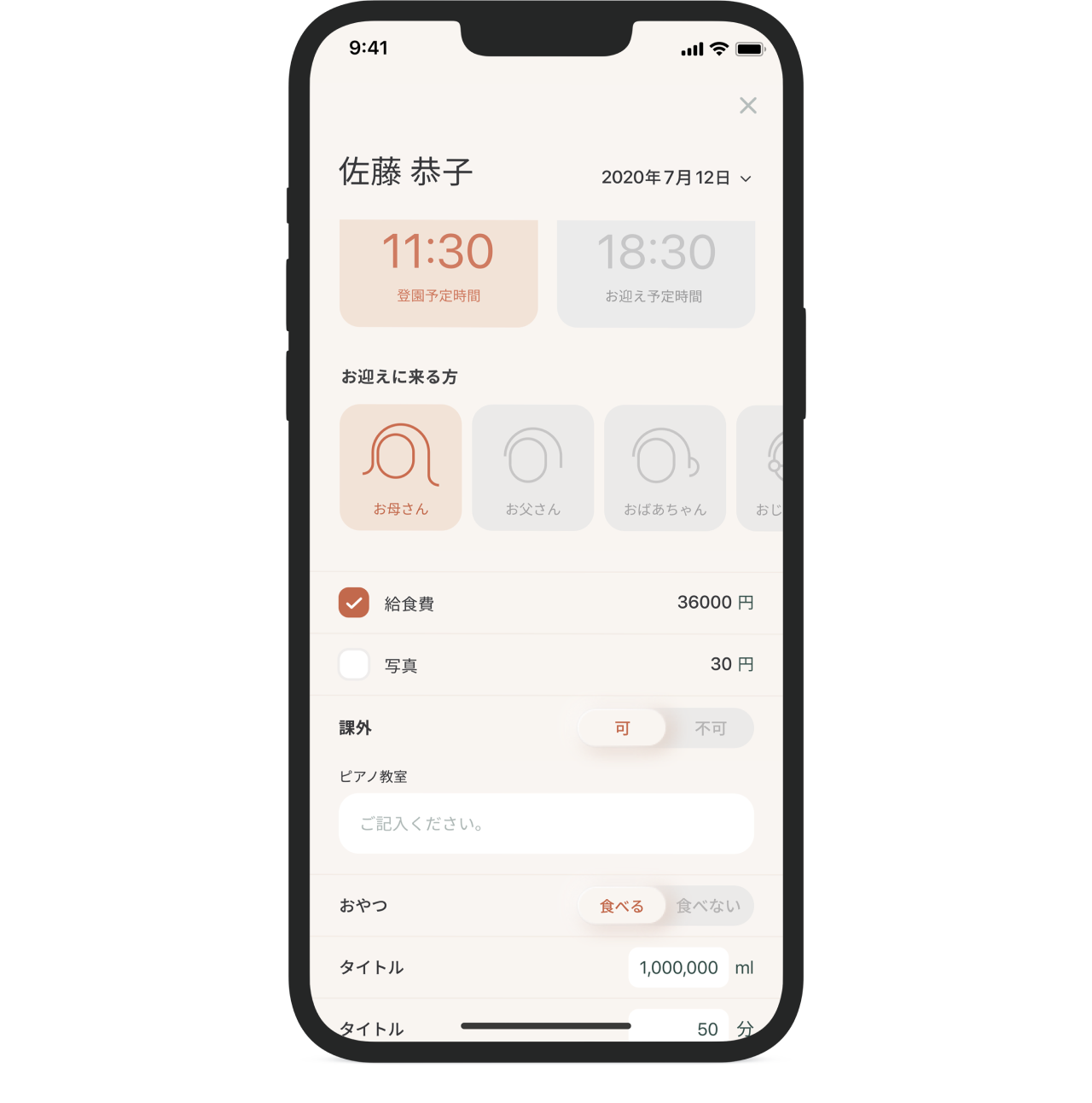
We designed the contact note, most frequently used in parents' work, as the main menu. By adding graphic elements and replacing text input with tab operation to reduce them as much as possible, we were able to speed up most tasks.
Simplified
events and schedules
events and schedules
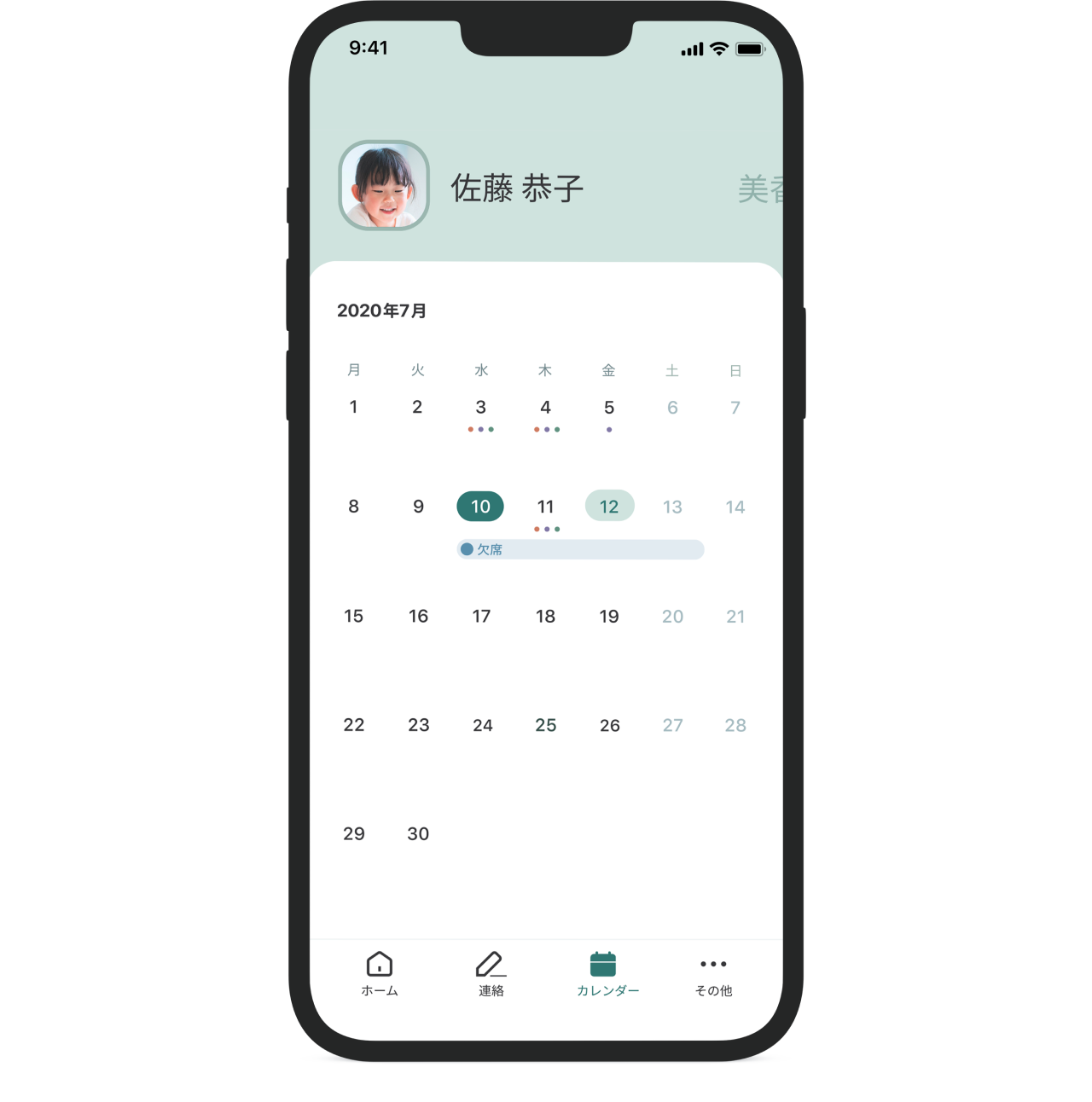
We used the calendar to help parents identify events and reservation information at a glance. The calendar can be switched weekly and monthly, facilitating parents' use.
VISUAL CONCEPT
The visual system focused on the view of parents who are product targets.
We established a visual system with three elements in mind: peace of mind, trust, and differentiation from competing products.
We established a visual system with three elements in mind: peace of mind, trust, and differentiation from competing products.

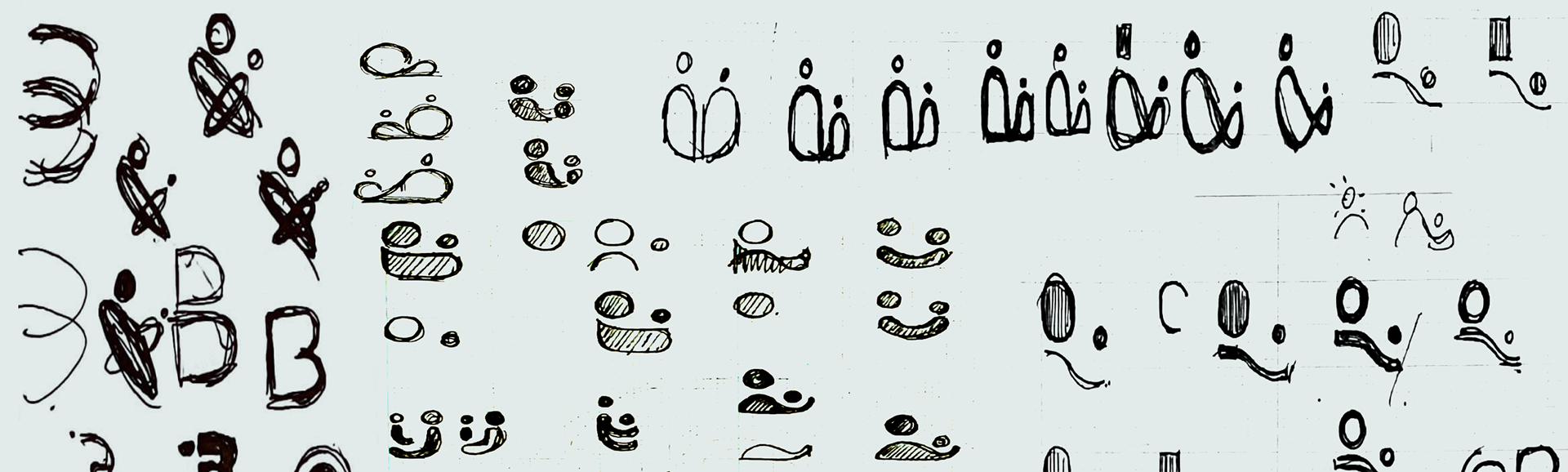
SYMBOL DESIGN
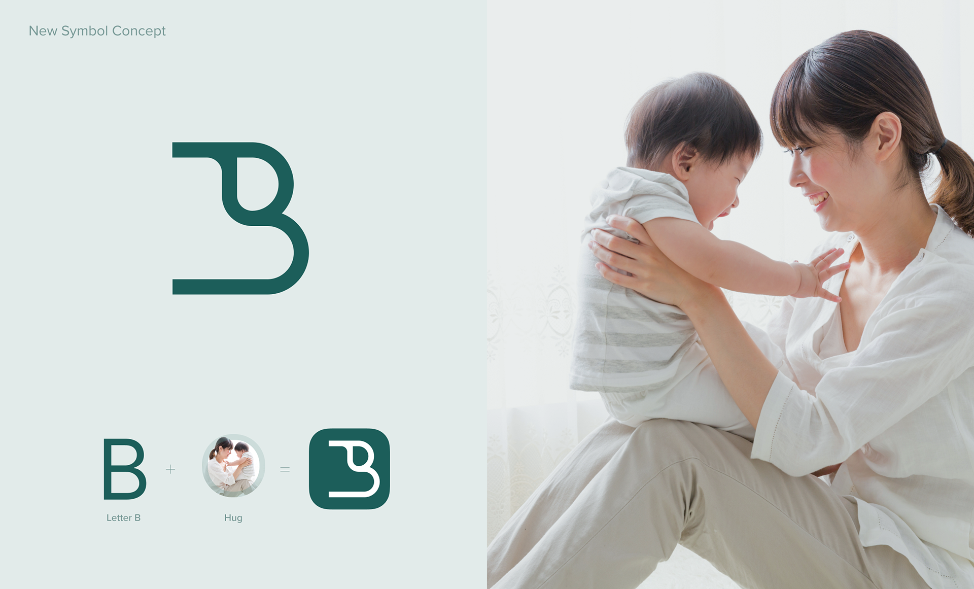
We combined the image of parents hugging a child with the first letter of product "B" to express the hearts of the parents and nursery school teachers who value their children.
COLOR
The color palette reflects the product's calming, approachable, and trustworthy nature. We selected a color that does not overlap with competing products.